Text is BACK on the menu. It was never really off the menu, but I like a spicy title.
Text is BACK on the Menu
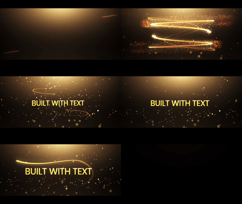
There are a few templates on IntroCave that have both a LOGO and a TEXT version. A good example would be the Breaking Glass template, where you can see the difference between the two below (editor's note: I'll eventually sunset the text-only version and redirect it to the logo version if this experiment goes well, but we'll always have these links to look back on!).
Just because IntroCave is billed as an intro maker doesn't mean that's the only thing people can use their videos for. While I do often see people using them for branding purposes, the text-only intro templates tend to perform pretty well. School projects, marketing videos, even section titles within a longer video: these use cases don't have a logo of their own, but more than half the templates on IntroCave are built around logos.
Believe it or not, the text version outsells the logo version by more than 70%.
So, economically speaking, I should just go and add a text version to EVERY logo template. Double the templates. Double the fun, right? There's one big problem with that line of thinking: I hate that there are two versions of that Breaking Glass template. It's the same styles, the same animations, the same audios. A good intro maker should support this sort of variations without making a user browse to an entirely different template page. I don't know that I'm ready to pronounce myself a good intro maker yet (I think IntroCave is pretty good), but I'm glad that I've figured out a way to offer this kind of variation without doubling the number of templates on the site.
Text to Image
When you customize an intro template, there's a new option underneath each image upload which will allow you to instead create an image on the fly using your choice of font and color. It looks like this:

Your font selection is limited by what I can pull in from Google's excellent selection of web fonts, but I'm pretty happy with the overall quality of them. I may do a little more curation on top of "give me the most popular 100" at some point if this feature does well, but the end result is just like if you'd created an image using Photoshop and uploaded it... only you can do it with a tiny bit of typing and a few clicks directly through the intro maker. The results look like this:

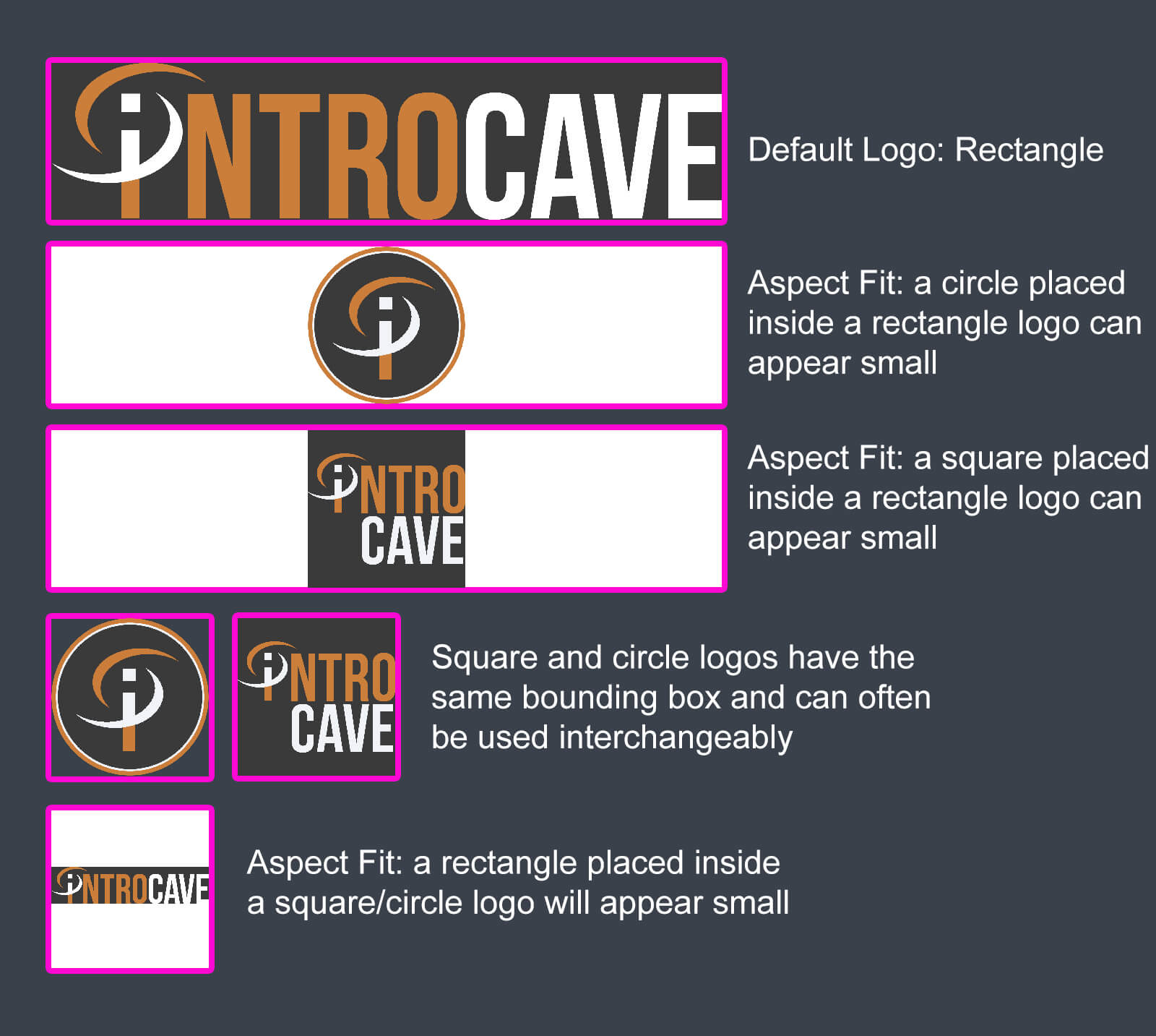
The new text-to-image feature is NOT a silver bullet. In an ideal world, it would only be an option for templates with rectangular logos. The output is just an image, and that image is going to get swapped in exactly as if you had created and uploaded it yourself. Text is generally pretty rectangular, so (naturally) that the aspect fit strategy employed by most templates is going to look best with rectangular logos. I wrote quite a bit about this in the Knowledge Center article about choosing the right template for your logo, but the most important part is summed up in the graphic below:

In an ideal world, I would add some metadata to every image option of every template for whether or not this feature was enabled. I'll probably do just that at some point. For now, I'm just excited to get the feature into the hands of real users and see how y'all respond. I do NOT recommend using this feature on fullscreen images (like those used in slide show templates), but I did a tally of how many templates currently use rectangular logos: 46 templates.
This feature adds 46 new templates to the site. With font/color control instead of just text control.
There are a further 20-25 templates that will work well with this once I switch them from a default circle/square logo to a more universal rectangle logo. So, with about a day's worth of programming, this could conceivably add 70 new templates to the site!

Improved Image Upload
The fancy new text-to-image capability is possible because of a related change I made. About 1/3rd of IntroCave's traffic is on mobile, and I've always had a hunch that mobile users would be better served by an intro maker that allows for some basic image editing on top of the normal rendering service.

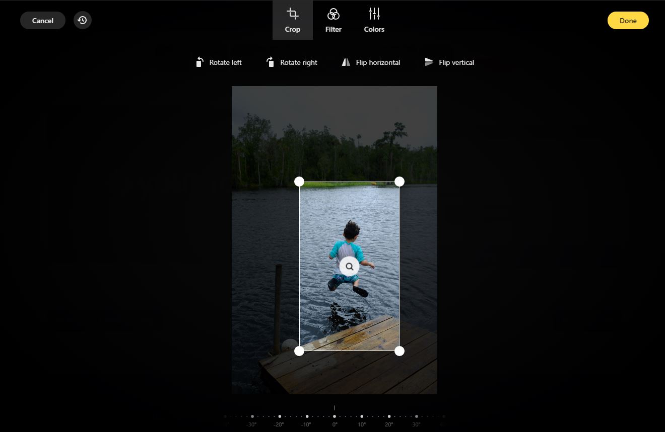
I'm using doka for this—it's not free, but good things usually aren't. The current version allows me to add things like cropping, filters, and color tweaks. I'm hoping that future versions will make it easy to overlay the logo from the template as a size guide so that it's easier for my intro maker to create videos that are exactly what a user intends. The current version supports mask guides, but it sort of assumes that your mask is going to be smaller than the uploaded image (this is often the case for profile pictures). I'd eventually like for users to be able to reposition their image within the Aspect-Fit bounds of the image from the template. Even without that feature, this is leaps and bounds better than the simple file upload I had before.
Because doka makes changes to the image in javascript, I had to rewrite how the backend server accepts images. Instead of passing a file reference, it now just sends the image data directly. I've done a few advergames and other javascript canvas experiments, so I knew that the built-in canvas could do similar things with image data. Having rewritten the intro maker customization tool to pass data around instead of files, it seemed obvious that I could finally add this text-to-image feature that I'd been dreaming of.
ExPeRiMeNtS: Empirical vs Analytical Data
As with any good experiment, I'm going to add some analytics around the new features and keep an eye on how they do. Data is wonderful, but so is real actual human feedback. If you've got thoughts on the new image upload or text-to-image features, let me know what you think! (support@introcave.com or tweet @IntroCave)